How Metro built a swipeable responsive WordPress site
Challenge
Metro is a newspaper read by 3.5 million urban commuters daily. Like other papers, it’s engaged with the revolution mobile devices have caused in people’s reading habits. Metro’s response to the challenge is to accelerate its evolution from a printed publication into a news brand. Its iPhone and iPad apps are read on 416,000 devices a month, but last year it decided it was also time to rework its website.
The Metro dev team inherited a site built on the noSQL CRX content repository with XSLT templates and a custom CMS written in Ext JS. It was a complex, problematic, hard-to-maintain, multi-tentacled monster. The developers who had built it had all moved on to other jobs. The CMS was only compatible with a particular version of Firefox. And when the back end eventually developed a persistent, untraceable memory leak it was clearly time for a change.
WordPress was chosen as the new CMS. It had a flexible plugin and theme architecture, an active community and a big knowledge base. It was fairly mature, having grown from modest beginnings in 2003 to become a full-blown CMS used in more than 60 million sites. It was delivering high-traffic publications like TechCrunch and BoingBoing. And it had an enterprise-level cloud hosting and support service in WordPress.com VIP.
Goals
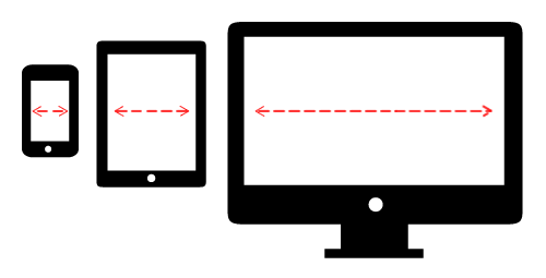
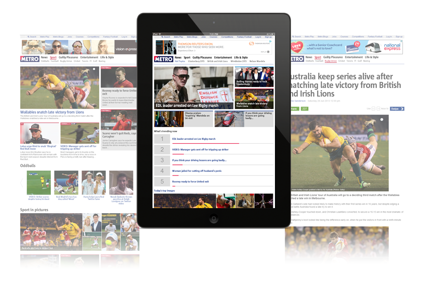
Our overriding aim was a consistent experience across devices. A responsive design was one of the earliest givens.
Because speed of response is so important to success on mobile, we thought mere CSS responsiveness wasn’t going to be good enough: we had to adapt our content before it got to the client.
We also decided to make our site swipeable. Our earlier experiments with a gesture-sensitive jQuery Mobile front end had suggested that a site that responded to swipes was a better experience on phones and tablets. It would support one of the most engaging features of those devices - and it might encourage readers to view more of our pages.
Approach
Ajax
Achieving responsive content demanded an Ajax single-page application. Inspired by the example of pjax, a nifty jQuery plugin that uses pushState to provide a fast Ajax browsing experience with a working back button, our JS ninja Stephan Fowler created a plugin that intercepted all internal click events to populate a central zone with the content the user wanted to see.
Responsive content, not just responsive CSS
In an ideal world websites would tailor their content to the available bandwidth. But measuring the device’s screen width seemed a more practical way to go. It would enable us to make a reasonable guess at a device’s capabilities. It made sense to tailor our content to the same breakpoints we used in our media queries. Stephan set them at 480, 768 and 1024, corresponding to the notional widths of a landscape iPhone, portrait iPad and desktop screen.
When someone first hits the site we serve up a minimal page and measure their screen width. If the measurement suggests a better-connected device we do an Ajax request for more weighty content. We pass a parameter called frag_width to tell the server how elaborate its response should be. We don’t save device information in a cookie or session - the JavaScript just continues to send the same parameter with every request.
The frag_width parameter tells the server-side code that we only want an HTML fragment. On the server side, the WordPress theme returns a fragment suitable for the frag_width breakpoint. A factory class in our PHP defines different image sizes and other options for each of our layouts. We cache up to 50 fragments on the browser side - we’ve found it makes a big difference in the speed of backward swiping.
This approach delivers the greatest data savings in images, but we also reduce bandwidth requirements on smaller devices by leaving out our sidebar content.
Swiping
To achieve the swipe functionality Stephan forked Matteo Spinelli’s swipeable image carousel SwipeView and mated it with our responsive content functions. The offspring of this union was a properly responsive site that swiped like a mobile app.
How it works
On first loading, the “Responsive Swipe” plugin checks if the browser supports the HTML5 history API needed for Ajax loading. If it does, it also supports the CSS3 transitions the swipe animation needs. If it doesn’t the plugin degrades gracefully: some devices - like older Android phones - don’t get swipe, while old desktop browsers and non-JavaScript clients get a traditional site without swipe or Ajax.
Just like SwipeView, Responsive Swipe expects this HTML markup on the page:
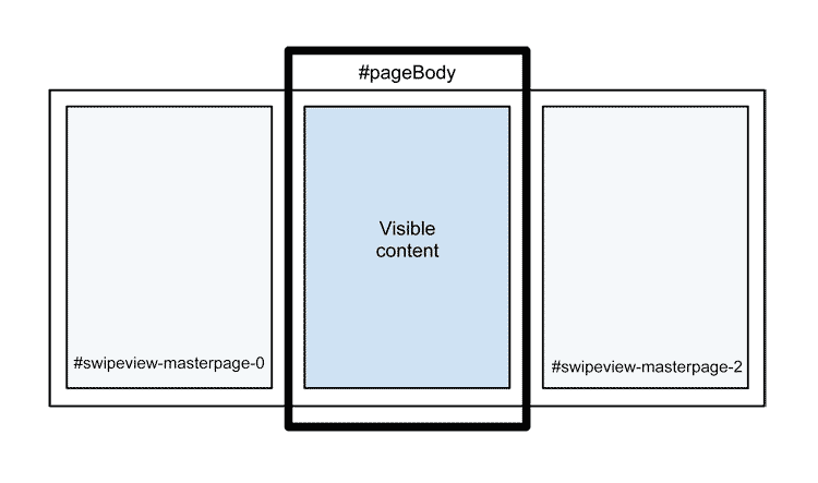
<div id="swipeview-slider">
    <div id="swipeview-masterpage-0">
        <!-- First left-hand content will load here -->
    </div>
    <div id="swipeview-masterpage-1">
        <!-- Main content is here -->
    </div>
    <div id="swipeview-masterpage-2">
        <!-- First right-hand content will load here -->
    </div>
</div>
These divs provide the framework into which the plugin loads HTML fragments. When the visitor first lands on the site the page loads normally, with the content in the central div, #swipeview-masterpage-1; then the plugin works out what the next and previous pages will be and does an Ajax request to preload their content into the off-canvas panes on either side. This sets the site up for a smooth response to a left or right swipe gesture.
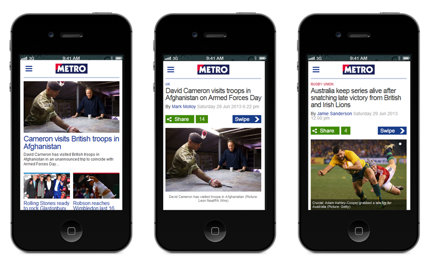
To work out which pages to swipe to, the JavaScript uses a simple list of URLs we call the edition. We pass this list when we initialise the plugin, but it can be changed at any time afterwards. In Metro’s case we have a general edition featuring the top stories from every content category, plus an edition for each category. If a reader clicks on a link to a sports article we change the list so their next swipe will show them another sports story. It doesn’t matter if the article they’re viewing isn’t in any edition: we’ll give them the next and previous articles in the same category.
Living without document ready
The main drawback we came across in building an Ajax single-page app is that the document ready and document load events don’t fire after the first page view. There are still many JavaScript utilities that rely on those events to do their work. We could find a workaround for most issues using a custom afterShow event, but some libraries either lack an API or have one that just works differently from the traditional version, as we found with the Lotame ad audience segmentation service.
Ad serving headaches
Probably the most taxing part of the project was coaxing the site to play nicely with the Google DFP ad serving system. Firstly we needed to tackle the complexities of providing a different version of each ad slot for each of our different layouts - so a 970 x 90 super leaderboard on desktops became a 768 x 90 leaderboard on tablets and a 320 x 50 mobile leaderboard on phones.
Added to this was the problem that our page included three different sets of ad units, one in the visible content, and two in the hidden panes to either side. Mix in the multiplicity of possible ad sizes and the ad ops team’s plethora of detailed ad targeting requirements, and ad serving becomes a major pain in the neck. Getting it right took weeks of head-scratching, multiple iterations and 250 lines of JavaScript.
What the experience taught us
- RESS adds complexity. Enabling the extra interactions between the browser and the server requires more code on both ends. In practice, though, a site like this isn’t outrageously difficult to build: much of our effort just went into working out the details of how it should behave. And if you start with sensibly organised JavaScript and PHP and keep your breakpoints to a minimum it’s not hard to maintain.
- Swipeability adds complexity. Responding to horizontal swipes demands additional JavaScript. It involves tricks like loading three pages of content for each page the user actually sees and constantly resizing the content container to make sure any overflow is visible. The extra complication involves extra effort.
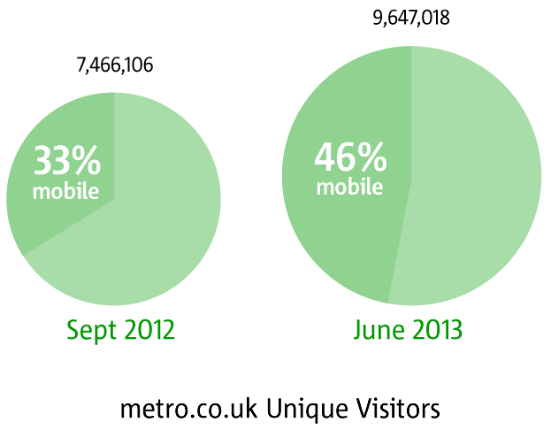
- But it’s nice. A swipeable site is a satisfying mobile and tablet experience. Our readers certainly seem to like it. Monthly unique visitors have gone up 30% since we launched in December 2012. In September 2012 we had 7.5 million; in June 2013 it’s 9.7 million. Swipeability may also have encouraged our mobile readers to stick around - page views per visit grew nearly 9% on desktops and 29% on tablets and phones, with return visits up 45%.
- A mobile-friendly site gets more mobile readers. Obvious, but true. The mobile share in our audience is up from 33% to 46%.
- WordPress is splendid. WordPress gave us exactly the kind of mature, flexible platform we had hoped for. We’re now the UK’s biggest WordPress site. And the content team are free to use any browser they like - nowadays they’re even posting from iPads.
There are still many things we want to improve. Further optimisation is high on our list - we’re currently thinking about better image compression and whether we can load our assets in more intelligent ways. The development process goes on, but we’re happy with what we’ve done so far, and we hope some of what we’ve learned in building this new style of site will prove useful to other developers.
Stephan Fowler’s published an open-source version of the Responsive Swipe jQuery plugin on GitHub, with documentation on this demo site.